Hopefully, you are able to see the new site design! I’m excited about a couple of the new features that will help you navigate a bit better. I like the bright & cheery colors so we kept the same color scheme but updated the look.
Navigation Bar
The navigation bar is now streamlined and just looks prettier! :) Plus, it now will not get hidden under advertisements.
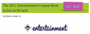
Hot Deals Button
You can now look to the right of a post title and it will indicate if I think it’s a hot deal!
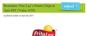
In addition to a Hot Deals Indicator, you will also see a expired deals feature. Hopefully, this will help alert you to deals that I’ve found that are expired.
Logo Clickable
The logo is now clickable to the home page instead of Twitter or wherever it was going! :)
There are other changes behind the scenes that don’t really affect you but will help keep things running smooth. Thanks to Oodletech for all their work on this project!


Aren’t there suppose to be stores listed with grocery and super stores?
I like the new design! =)